PLEASE NOTE: Battle Action #1 is presently available in digital form, and as a print comic for UK distribution. The print-format series will be available in North American comic book stores beginning in July.
* * *
The first thing that hits you is Keith Burns’ aerial combat cover—listed as the "Newsstand" variant overleaf—a painted tableau depicting a graffitied Hawker Hurricane screaming out of the sun and plummeting towards a squadron of Luftwaffe bombers. Given the painstaking attention to mechanical detail, this eye-catcher is immediately evocative of cigarette cards or other printed 20th century collectibles obsessed with regurgitating triumphant imagery from the Second World War. What Burns’ pin-up does not look especially like, though, is an actual cover for IPC Magazines’ various permutations of Battle Picture Weekly.
The long-defunct anthology (running under various titles from March 1975 until January 1988, when it was merged into Eagle) was printed on smudgy newsprint paper, and would often use for its covers either a full-cover splash alerting potential readers to the free gifts lurking inside, or a color establishing image sequentially connected to one of the black & white strips that followed, when picketing for notice. Although Burns’ brush stroke dogfight maintains this desire for instantaneous storytelling—functioning as a sort of panel zero for the Garth Ennis-penned Johnny Red strip that begins once the formalities of credits and copyright notices are dispensed with—the illustration itself is much too luxurious and visually complicated for such a bog-standard medium of distribution as was afforded by pocket money-priced newsagent filler like Battle.
 In certain respects, Burns’ painting is reminiscent of the sort of cover imagery you’d see decorating DC Thomson’s similarly-themed rival, Commando: a 7" x 5½" digest comic first published in the early 1960s and still released to this day. When held up against the comparatively somber Battle, Commando is far more interested in depicting warfare as a rolling opportunity for valorous behavior, rather than the meat-grinder that soldiers actually experience. The cover art is designed to denote a certain kind of prestige, the publication positioning itself as a cut above its contemporaries with attention-grabbers deliberately evocative of the swirling illustrative pin-ups that adorned mass market paperback novels churned out in the 1960s and '70s. Look a little closer at Burns’ artwork, though, and it becomes apparent that there are much more complicated, gestural qualities at work.
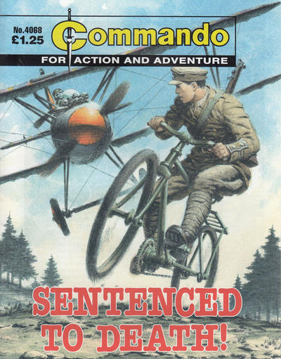
The archetypal Commando cover positions its subjects as underdogs: young British men assailed by unfeeling (and usually German) machinery. Indeed the Wiki entry detailing the comic’s history is furnished with one such image: Ian Kennedy’s painting (taken from issue #4068) of a Tommy struggling with his gravity-defying bicycle as he is strafed by a red-tipped biplane. The situation proposes a dangerous and exciting incident, but the execution is surprisingly safe, chummy even. The soldier is unruffled and his uniform unspoiled as he ollies away from the incoming propeller blades, able to avoid calamity thanks to his fluency with a pedal-driven vehicle favored by children: the playacting audience this image is intended to stir.
Comparatively, Burns’ subject—fugitive RAF pilot Johnny Red’s screaming, machine-gunning aircraft—is the aggressor: a bushwhacking single-seater aimed directly at an incoming bomber convoy. Burns’ piece describes his Allied ambush with waves of elasticated bullet casings pouring out of Red’s plane as the withered enemy craft below him list, then burn. The cover is not simply exciting or attention-grabbing, it’s bloodthirsty. Unusually, there’s even a light insinuation of selflessness on the part of the enemy fighter craft accompanying these massing bombers: a lone Luftwaffe fighter plane blazes in the space between Red and his targets, perhaps following an attempt to draw the incoming gunfire away from the craft he was escorting. The soot cloud of smoke spilling from the Stuka even seems to originate from the Battle Action logo, an airborne fireball launched from a massive crimson A.
* * *
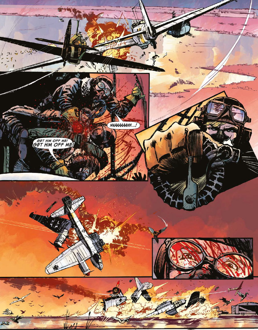
Based on the two stories present in this opening issue, Ennis’ and Rebellion’s five-issue Battle Action revival will, despite largely featuring characters derived from the Battle wing of the property, hew with greater sympathy to the individual identity of Action, the comic that was merged into Battle Picture Weekly back in 1977 to form Battle-Action. Although “The Falcon”—a Johnny Red adventure scripted by Ennis, with art by Burns, colors by Jason Wordie and letters by Rob Steen, utilizing a character originally devised by writer Tom Tully and Charley’s War artist Joe Colquhoun—does continue the skirmish begun on the cover, a significant section of the tale revolves around a bird of prey purchased to see off a raft of ducks that have settled next to a Soviet airfield. The eponymous falcon allows Burns to sketch a different kind of air combat, one as weightless and bloody as a seinen manga.

The second story, “HMS Nightshade”, is scripted by John Wagner, who created the naval combat feature in 1979 with the late Mike Western. Drawn here by Dan Cornwell, with colors by Len O’Grady and letters, again, by Rob Steen, the new story is a belated 10-page conclusion to Wagner's long-running saga, using Cornwell’s knack for gurning, Drunken Bakers-style faces to wrong-foot readers expecting notes of triumph to creep into this seafaring curtain call. Such dedication to butchery and thwarted idealism, at least as present in this opening issue, seems indicative of a Battle Action that will take a compassionate approach to the enforced amalgamation of Battle and Action.

Action, as devised by Pat Mills and Wagner, pre-2000 AD, was a short-lived boys' comic that explicitly looked to the characters chewing up the cinema screen for the majority of its inspiration. The magazine delighted in portraying these heroes as bastards: Spielberg’s great white shark was elevated to the level of anti-hero in "Hook Jaw", while "Dredger", an amoral and sadistic secret agent that Ennis has reactivated several times since Rebellion's Action 2020 special (and whose return is promised for the third issue of this particular run), is like a poliziottesco take on James Bond. That was not the totality of Action’s appeal though. If Battle allowed readers to decode the trials and tribulations of the generations that came before them, Action was sympathetic to the plights facing the British children of the 1970s.
 In addition to the ink-streaked aspiration of state-sanctioned murder, editor Mills included stories in Action with subjects closer to his audience’s lived experience. Writer Stuart Wales’ and artist Tom Hirst’s "Probationer" used the winking visual appeal of romance comics to detail the exploits of a delusional small-time criminal, while "Look Out for Lefty!" was a distinctly working-class take on the requisite association football strip, with themes of poverty and hooliganism. A panel depicting Lefty’s tartan teen girlfriend Angie striking one of her boyfriend’s uncooperative teammates with a Coke bottle launched from the stands (drawing effusive praise from Lefty and framing a group of rival fans in the process) became the lead image in a Daily Mail article that reported several appalled soundbites from a variety of football governing bodies. That this pen and ink hooliganism occurred in the infamous 18th September 1976 issue, featuring Carlos Ezquerra’s fantastic bobby-lashing "Kids Rule O.K." cover, only compounded the censor-baiting issue. Following this outpouring of tabloid scorn—and subsequent threats to its IPC parent from high street retailers—Action was first editorially neutered, losing much of its readership over the following year, before being consumed by its more successful stablemate, Battle. Although this unity was christened Battle-Action, the emphasis was firmly on the former, with war-themed strips like Gerry Finley-Day’s & Mike Dorey’s "Hellman of Hammer Force" best positioned to survive the merger.

In a sense, Ennis’ new series is a revisionist take on this comingling of two tonally disparate comic properties; one that takes the characters and situations found in Battle, then re-imagines them through the antagonistic, anti-establishment prism of Action. This fusion might therefore be read as the equivalent of Judge Dredd Megazine for the British war comics of the 1970s: a glossier comic aimed at an older audience still looking for their ultraviolence fix, where lurid full-color mayhem sits alongside the hollowed-out pathos earned over dozens of installments of episodic bloodletting.
The post Battle Action #1 appeared first on The Comics Journal.

No comments:
Post a Comment