The first release from MarvelArts—a presumably ongoing collaboration between Marvel Comics and Abrams ComicArts (an imprint of Abrams Books, which is a subsidiary of the French publishing house La Martinière Groupe)—Alex Ross’ Fantastic Four: Full Circle is a glossy hardcover platform for the writer-illustrator to reinvent his own wheel. This book’s story is, in part, a follow-up to the classic Fantastic Four installment “This Man… This Monster!”, a depressive interlude from June 1966 in which Ben Grimm describes himself as "an orange-skinned freak" before being drugged and having his physical identity stolen by a stocky scientist who is jealous of Reed Richards’ universe-shaking achievements. Jack Kirby’s and Stan Lee’s story ends with this envious inventor stranded in a collapsing alien dimension, having redeemed himself, facing imminent death. Full Circle returns the doomed doppelganger to the topside of the Marvel universe as an anti-matter specter who interrupts Grimm’s failing attempts to rustle up a midnight snack in a fully stocked, retro-futurist Baxter Building. Subjected to Richards’ pop-art probes, this phantom cracks; the intruder is revealed as a mindless hollow chrysalis, containing all manner of writhing alien creatures. Following a speedy analysis—while the rest of the team clean up the mess—Reed resolves to take the fight to the source of this outrage: the Negative Zone.
Ignoring the superlative cover, Ross appears to be sticking to his tried-and-true gouache paints in Full Circle’s early goings. The first few splashes are various shades of swirling blues and whites—broiling clouds of rocket smoke against an idealized sky—that retell the cosmic ray origin of Marvel’s first family from the perspective of Sue Storm. In terms of bullet-point plotting and a first-person voice driving the details, this introduction is reminiscent of issue #0 of Ross and Kurt Busiek’s Marvels—the supplementary pamphlet that followed the 1994 miniseries’s original run—even down to the block capital font used in both episodes (the letterer here is Ariana Maher). What follows Full Circle’s prologue, though, is a complete change of pace for Ross: the artist’s tight pencils are no longer worked over with layers of painted color imitating creased clothing. Instead, Ross’ painstaking brush technique is used for inking, his line so delicate and sympathetic to the graphite scaffolding he has put in place that the comic often appears to be directly reproducing pencil textures.
This effect is somewhat comparable to the final issues of NOW’s Terminator: The Burning Earth (1990) when Ross, apparently pushed for time in his longform series debut, seemed to be using chalks and pastels on black paper when portraying nighttime laser battles between hirsute humans and catwalk cyborgs. Here, Ross' and Josh Johnson's colors are deliberately limited: a four-color approach that favors blocks and harsh gradients over more natural mixes, the stippled dots of arcane coloring processes deployed as an expression of energy to compliment Kirby’s trademark krackle. The color is never allowed to overwhelm Ross’ linework, though - it exists as a subordinate Copic marker-presenting layer blaring underneath the ink-black structure.
This super-sized reproduction also has a therapeutic dimension to it, one not always afforded to the 1960s and '70s artists that Ross is homaging in Full Circle. Anyone familiar with the massive penciled pages shown off in TwoMorrows Publishing’s Jack Kirby Collector will have seen blocks of design or detail that never made their way to the finished comic. Background figures that were deemed extraneous disappeared into all-consuming shadow; technology that was too complicated or alien for inkers like Vince Colletta to accurately finalize and still meet their deadline was simplified, losing the idiosyncratic shape that Kirby had imbued them with. Ross cues into the vaulting maximalism Kirby blasted onto his original art, delivering a comic that throbs with psychedelic astral planes and canted views on apartments-cum-laboratories that seem to expand in every direction.
Although the extra attention Ross has paid to his inks stage may sound like a minor tweak in process, the results are a seismic shift in how the artist presents his work. Previously, Ross’ output had tended towards the commercial end of the spectrum, the illustrator using fine art techniques to lend a sense of legitimacy or verisimilitude to a variety of increasingly obscure superhero characters. Such work emanated from a very specific point in time, one in which live-action superhero films were not the totality of the mainstream filmgoing experience. As the 20th century limped to its conclusion, Ross offered nervy publishers an opportunity to see their properties in poses and postures that presented as real - their lighting and composition drawn directly from still-life photo shoots. Ross even bucked the body armor trends of the pre-Marvel Cinematic Universe era with an aesthetic that, essentially, tidied up the kind of outfits worn in the black and white film serials of the 1930s and 40s, or the CBS made-for-television Spider-Man movies screened in the 1970s. Ross doggedly rendered his figures in unembellished, demilitarized comic costumes, refusing to alter outlines or colorways to fit a more obviously aggressive, modern aesthetic. The result was the titans of the Marvel and DC universes executed in such a way that there was an obvious and notable commonality between Ross’ vision and that of Mexican luchador wrestlers or Japanese Super Sentai heroes. A pleasant kind of international unity expressed simply by hanging colorful regalia on straining human musculature.
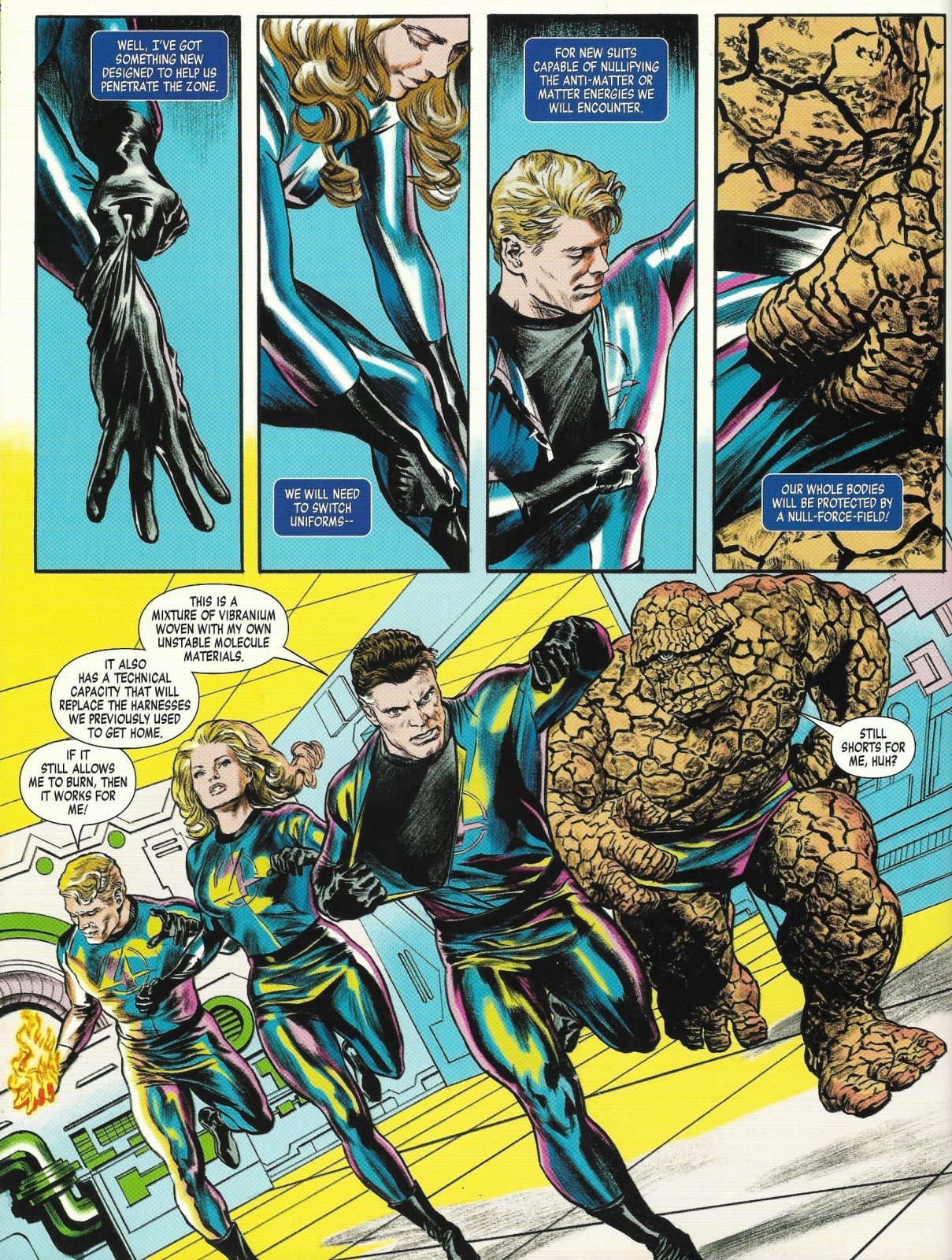
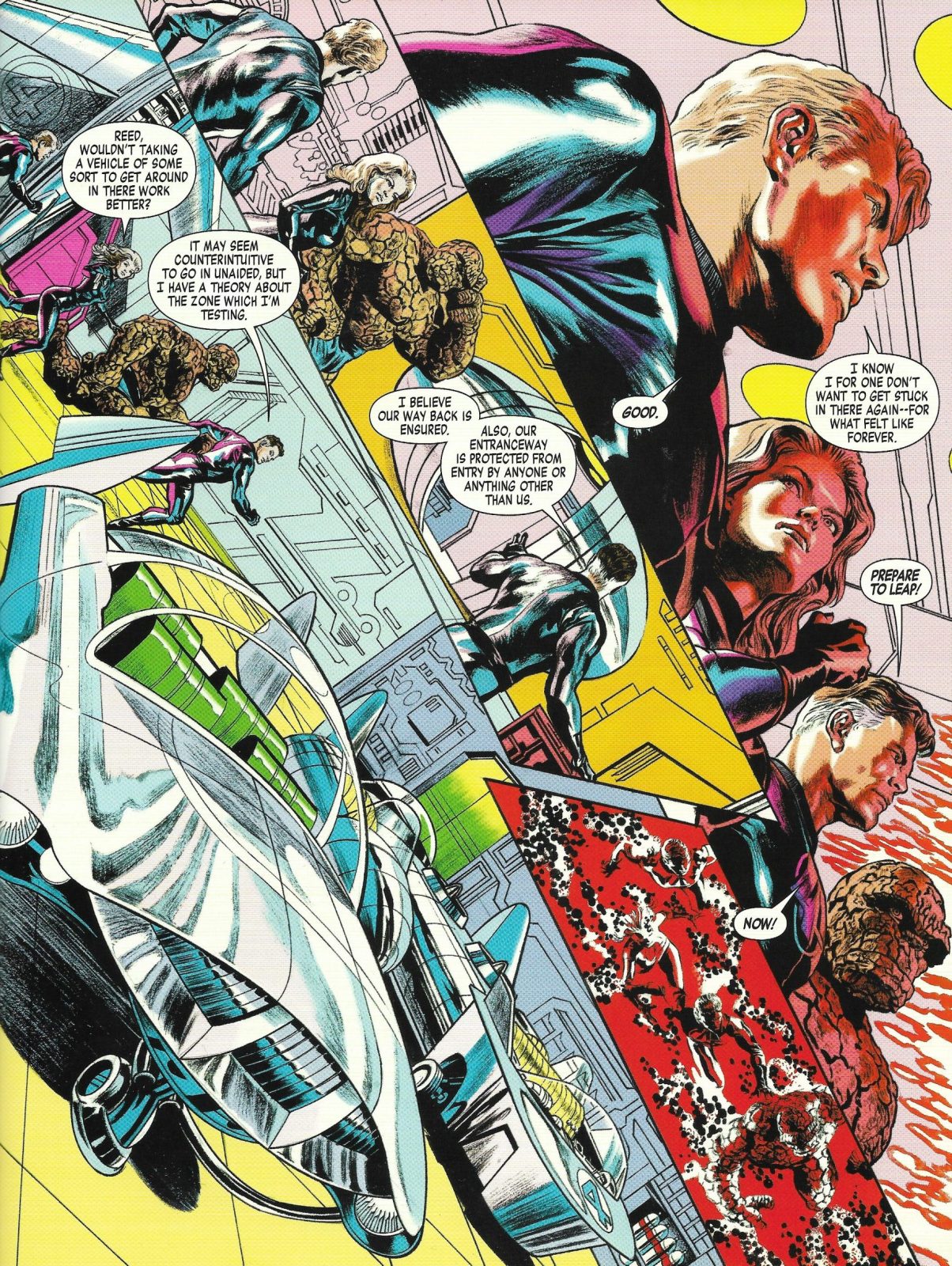
For Full Circle, Ross retains an observed quality in his figures and faces—Sue Storm in particular often looks like Tippi Hedren by way of Claudia Cardinale—but the overall execution communicates a clear tonal shift in how even basic layouts have been approached. Rather than launder the comic language of the 1960s through Rockwell and Time magazine Americana (or resort to a Lichtenstein-style pastiche), Ross sticks to examining and aping the hyperbolic assembly of his predecessors. The static medium shots of the artist’s prestige work give way to the logistically impossible. The Fantastic Four’s entrance into the Negative Zone is a superb expression of these energies, the pages structured in such a way that the reader can’t help but think of the hair-raising path of a rollercoaster. On one page we see the superhero group—clad in new, iridescent outfits that glimmer like Project Mercury era space suits—running uphill in their endlessly flat New York apartment space before hanging at a tipping point on the following page, as Reed details the metaphysical leap they are all about to make. No adverse gravity is actually acting upon these figures, but the effect of Ross panels is palpable: reality is being inverted and we are all about to tumble headlong into something incredible.
The post Fantastic Four: Full Circle appeared first on The Comics Journal.


No comments:
Post a Comment